
As a knitter, I know what colors I like the best. For me, any shade of pink has me running around the yarn store like a dog with the zoomies. But when it comes to knitting multiple colors together, I tend to be more like a dog chasing my tail.
So, I dove into some basic color theory for artists to learn how to make my knitting prettier when working with different colors together. (And to make my knitting store purchases a little less tail-biting.)
Here’s everything I learned:
Black and White Photo Trick for Knitting with Multiple Colors
I am currently using this method to help choose multiple colors for a Westknits shawl I am starting. Sometimes the best tips and tricks are from fellow knitters, and I learned this savvy tip for choosing yarn colors from a fellow knitter.
Simply lay out your yarn choices and snap a photo. Then edit the photo in your phone, saving it as a black and white image. (All phones are different, but on my iPhone, I go to edit and choose the black and white filter.)
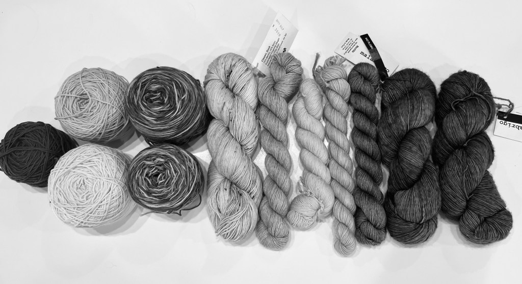
Studying the black and white photo, I can tell that I will likely not use the dark teal blue as it seems to disappear when next to the dark grey that I have chosen for the main color. I also think the dark pink on the far left is a poor choice against the grey. Go ahead, try this when choosing your next color combination when knitting with multiple colors.
Color Theory for Artists
My daughter is in her final year of studying interior design, and I can just imagine her eye roll and sigh as she says, Mother you know nothing about color theory. And she would be correct! I will not dive into the deep annals of history dating back to ancient Egypt and their use of the color blue, as fascinating as that is.
Let’s keep this simple and go back to kindergarten when we began learning our primary colors and basic color theory. Am I the only one who remembers the astonishment of mixing yellow and blue, making green!? My little brain tap danced in amazement.
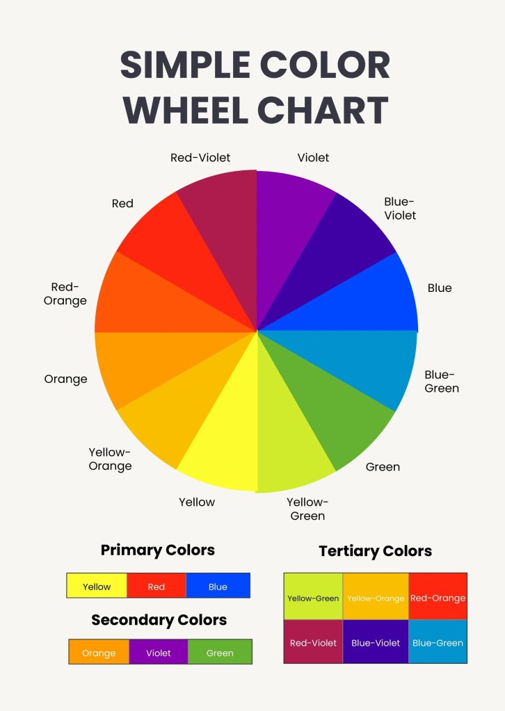
As you can see from the simple color wheel chart, basic color theory revolves around primary colors, secondary colors, and tertiary colors. If you are knitting with different colors and want to knit something bold and bright, it is best to look at the opposing sides of the color wheel and choose complementary hues such as red and green, or blue and yellow-orange, according to this color wheel chart.
If you are wanting to design a spectacular Stephen West shawl that looks like an ombre sunset, then it is best to look to analogous colors such as red, red-orange, orange, and yellow-orange.
3 Color Knitting
Choosing multiple colors for a knitting project can be daunting, but I think it is hardest to choose colors for a 3-color knitting project. It’s easy to pick those first two colors, but then how do you pick the third?
Let’s experiment and choose some colors for a 3-color knitting project. What could be a 3-color combo to knit up a bold sweater that’s more dramatic than Swifties discovering a double album drop at 2 a.m.?
If we refer back to the color wheel and basic color theory, it seems a good dramatic choice for 3 color knitting could be: yellow, violet and red-orange, or yellow, violet and blue-green, or another fun possibility would be blue, orange and yellow-green.
How did I decide this? Well, for a bold look, I chose two complementary colors and then looked at the color that was exactly in the middle of those. By doing this, you get a couple of color options to choose from that are guaranteed to pop!
Of course, if you’d like to choose a calmer 3 color knitting combination, then you could look to a relaxing trifecta of blue, blue-green and green, or perhaps orange, red and violet for a pop of analogous colors.
Either way, the color wheel is your new yarn bestie! I have one saved on my phone and refer to it whenever I am stash diving or shopping a local yarn store.
Do you have any tips or tricks to share for choosing multiple colors in your knitting or fiber arts? Please share!


Leave a reply to The Best Basic Knitting Stitches for Beginners – The Tortured Knitters Dept. Cancel reply